Color Guidance — Accessible, Branded, and Scalable Visual System
Project: Defined and implemented accessible, systematized color palettes and UI color mappings for Outlook, enabling consistent, branded, and inclusive visual experiences across Mail, Calendar and theming surfaces.
Situation
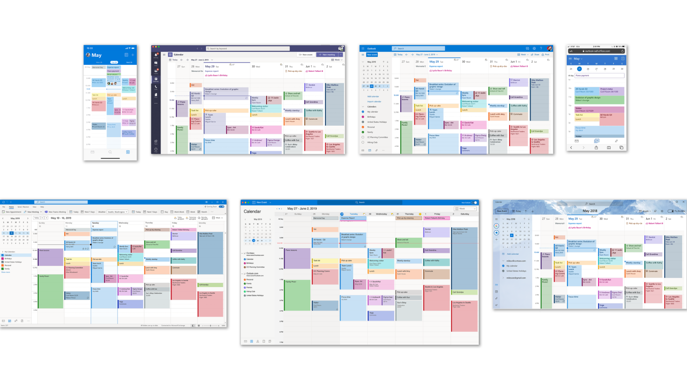
Outlook’s visual evolution required comprehensive color guidance framework that would modernize design while ensuring accessibility across all themes and modes. The system needed to support user personalization without compromising brand cohesion, and would serve as foundation for One Outlook unification across Windows, Web, Mac, and Mobile surfaces.
Business Context: This work needed to inform dark mode guidance across Outlook and contribute to broader Microsoft 365 web initiatives, requiring careful balance of brand integrity, user choice, and technical implementation feasibility.
Task
As Design Lead, I owned the complete definition and implementation of comprehensive color guidance framework spanning brand palettes, dark mode, UI colors, and customizable calendar/category colors across all platforms. My responsibility included modernizing visual design while maintaining accessibility standards and supporting design system unification.
Action
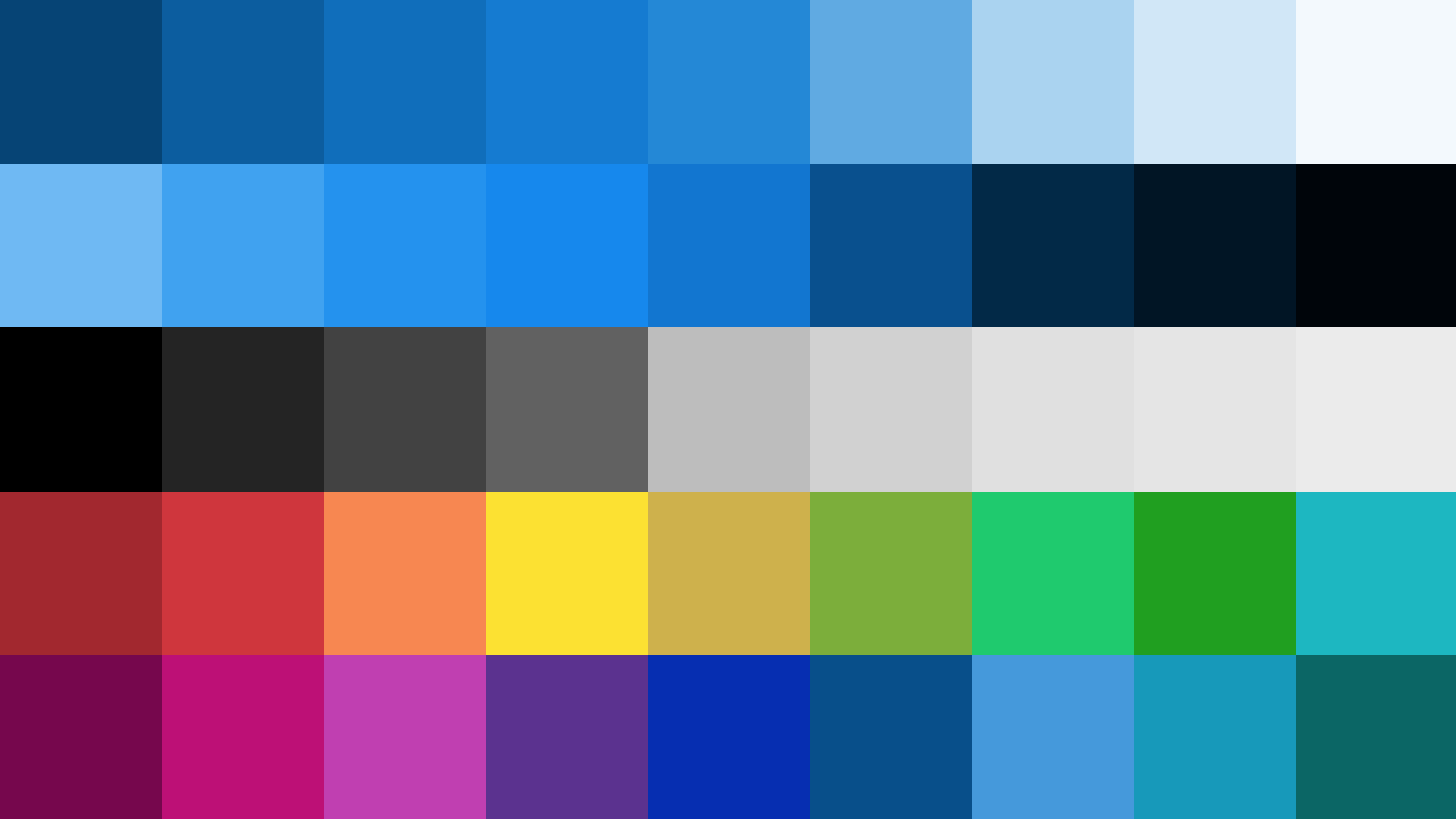
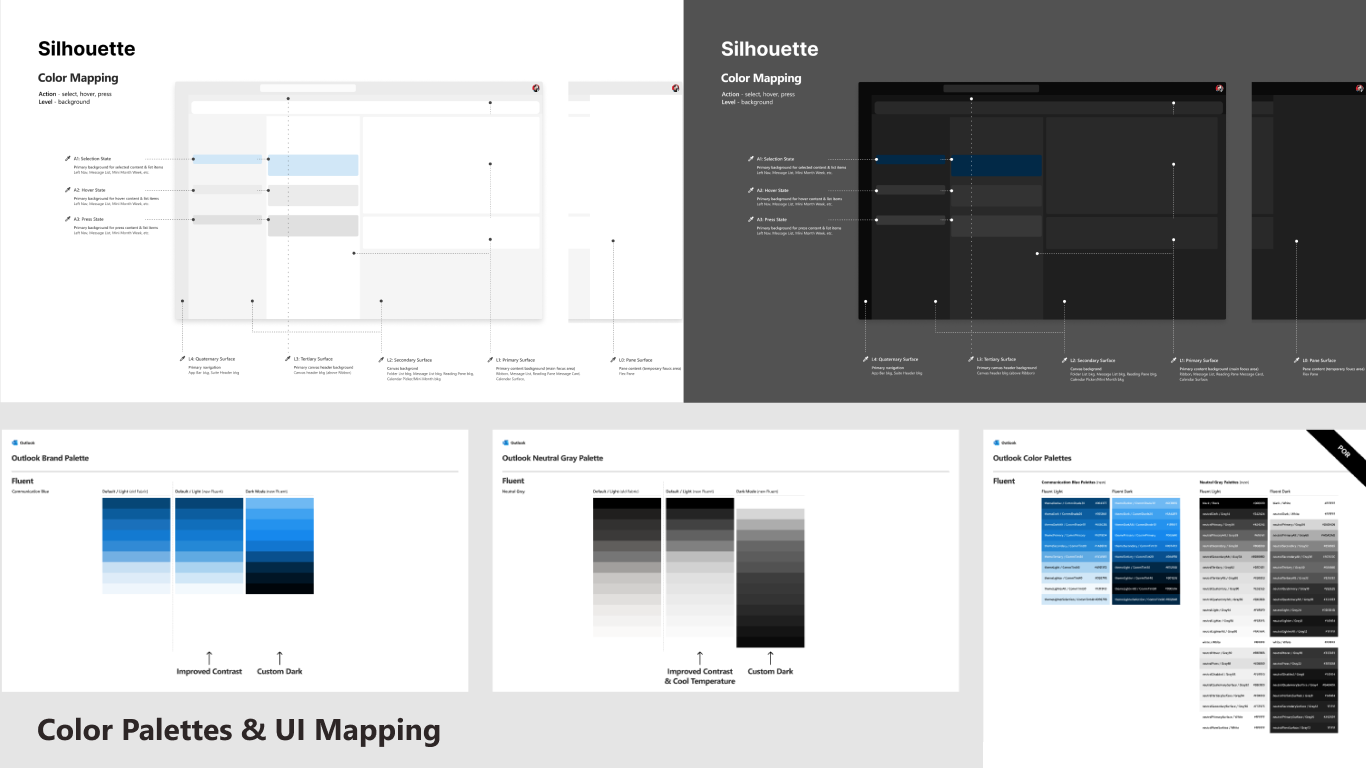
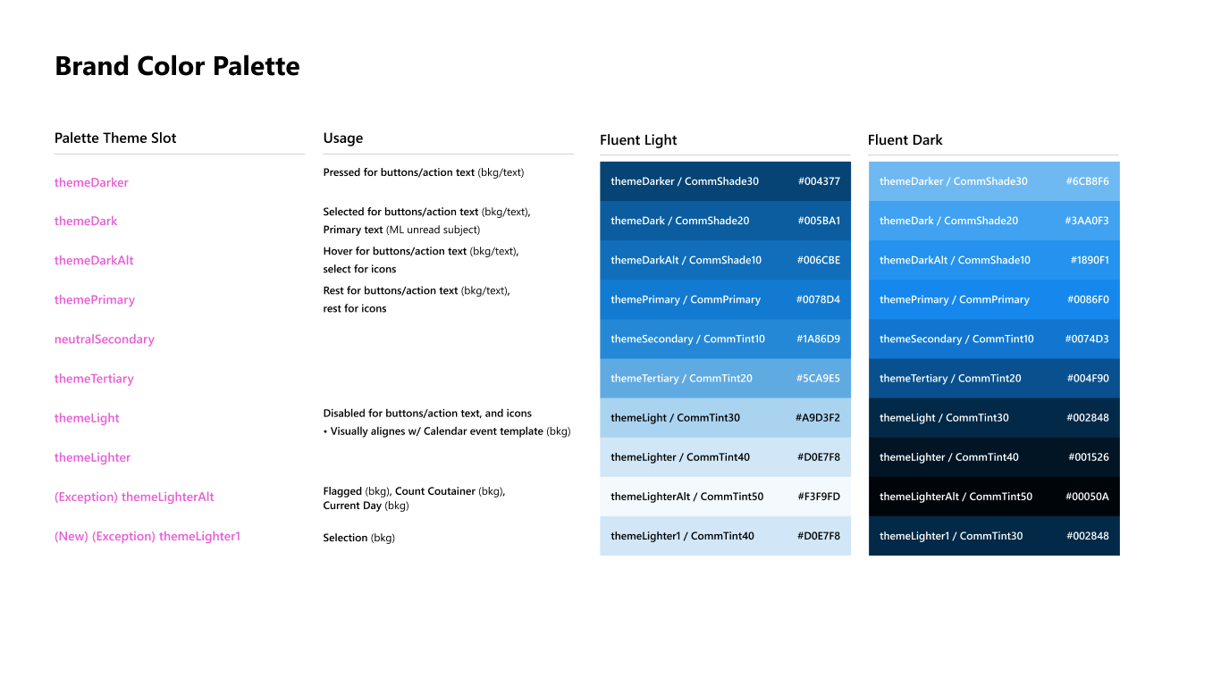
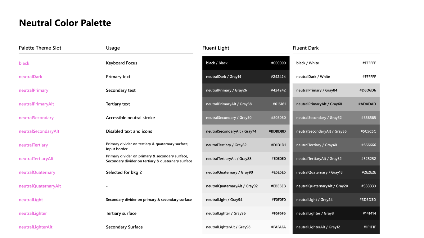
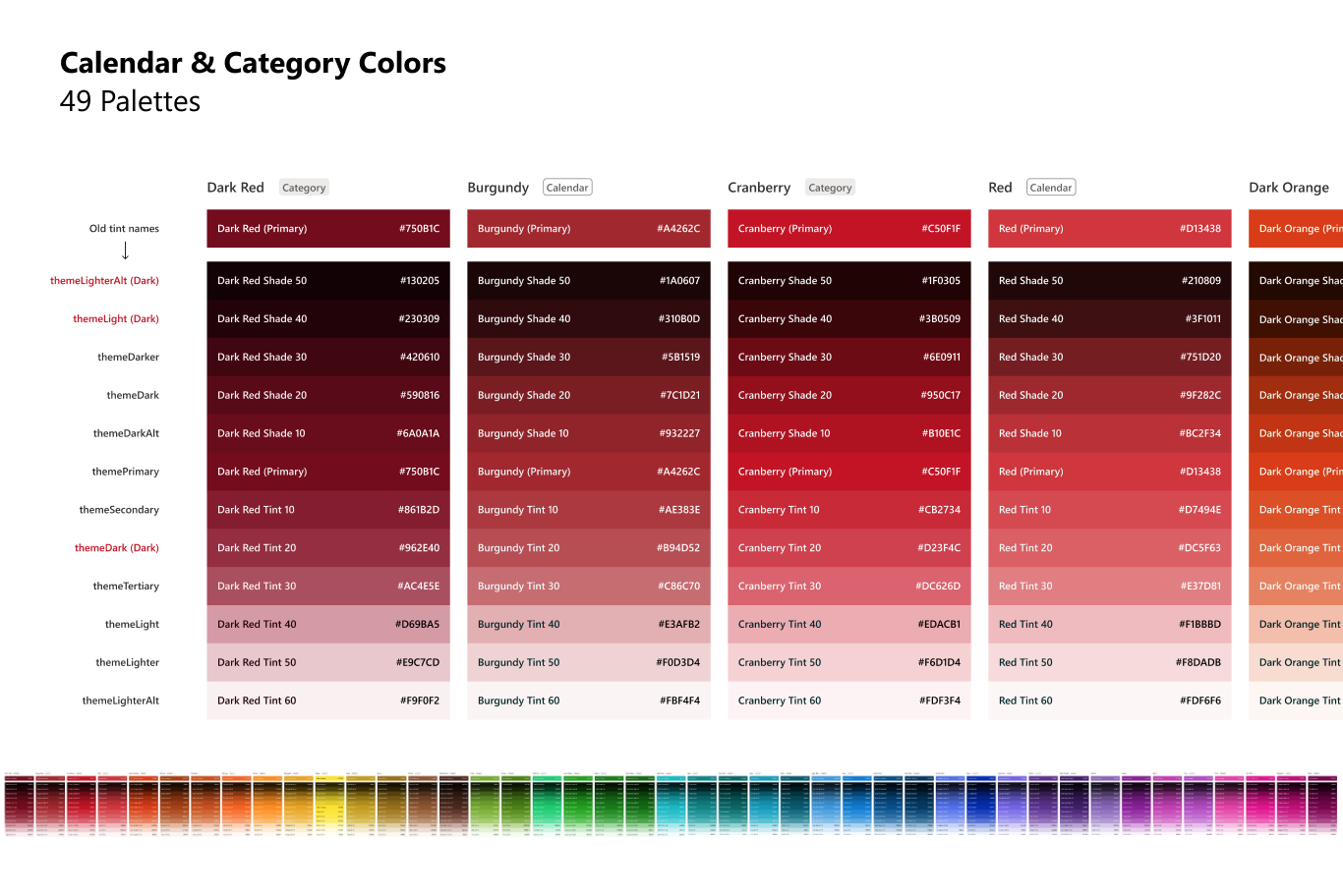
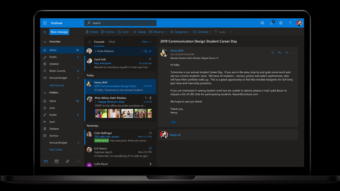
Strategic Palette Development: Created accessible brand palette rooted in Fluent UI principles while optimizing for Outlook’s unique personality and user needs. Developed neutral palette system ensuring seamless compatibility across all themes and interaction modes.
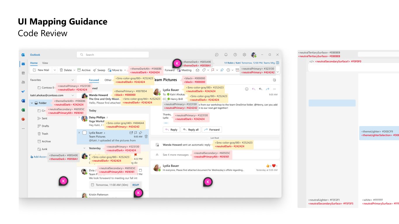
Systematic UI Implementation: Built comprehensive guidance framework connecting semantic color tokens to interface components including buttons, backgrounds, borders, and text. Collaborated closely with engineering teams to validate implementation feasibility and maintain design integrity.
Accessibility Leadership: Conducted rigorous contrast testing across all themes to ensure WCAG 2.1 AA compliance. Integrated support for full-bleed image theming and dynamic mode switching while maintaining readability standards for all users.
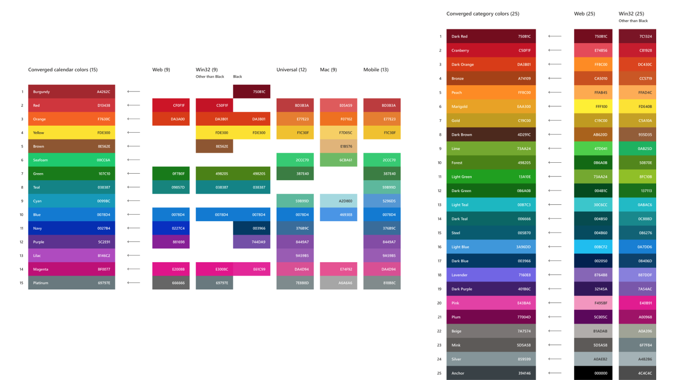
User-Centered Customization: Designed calendar and category color palettes that balanced user personalization needs with clear visual differentiation in high-density interface contexts. Applied customer obsession by prioritizing usability across diverse workflows.
Documentation & Alignment: Delivered comprehensive usage guidance and Figma libraries to enable consistent implementation. Presented strategic recommendations in leadership reviews to secure cross-functional alignment and resource commitment.

Results
Systematic Implementation: Color system successfully implemented across all Outlook modern endpoints, enabling scalable and consistent visual design that aligns with Microsoft’s broader brand system and design principles.
Accessibility Impact: Achieved comprehensive accessibility compliance with all text and interactions meeting standards across themes and modes, significantly enhancing readability for millions of users while reducing accessibility-related support requests.
User Experience Enhancement: Calendar and category color palettes delivered meaningful personalization options that improved daily usability and user satisfaction while maintaining visual clarity and system coherence.
Engineering Acceleration: UI color mapping framework significantly accelerated engineering implementation timelines and improved design-development collaboration, reducing friction in cross-platform development cycles.
Strategic Platform: Became foundational infrastructure layer for broader theming innovations including AI-generated themes, default theme initiatives, and future product roadmap developments across the Microsoft ecosystem.
Organizational Influence: Established new organizational standard for color accessibility and systematic design thinking, with methodologies adopted across multiple Microsoft design teams and product areas.