Outlook Branding — Visual Identity at Scale
Project: Outlook Icon Refresh (phase 1)
Situation
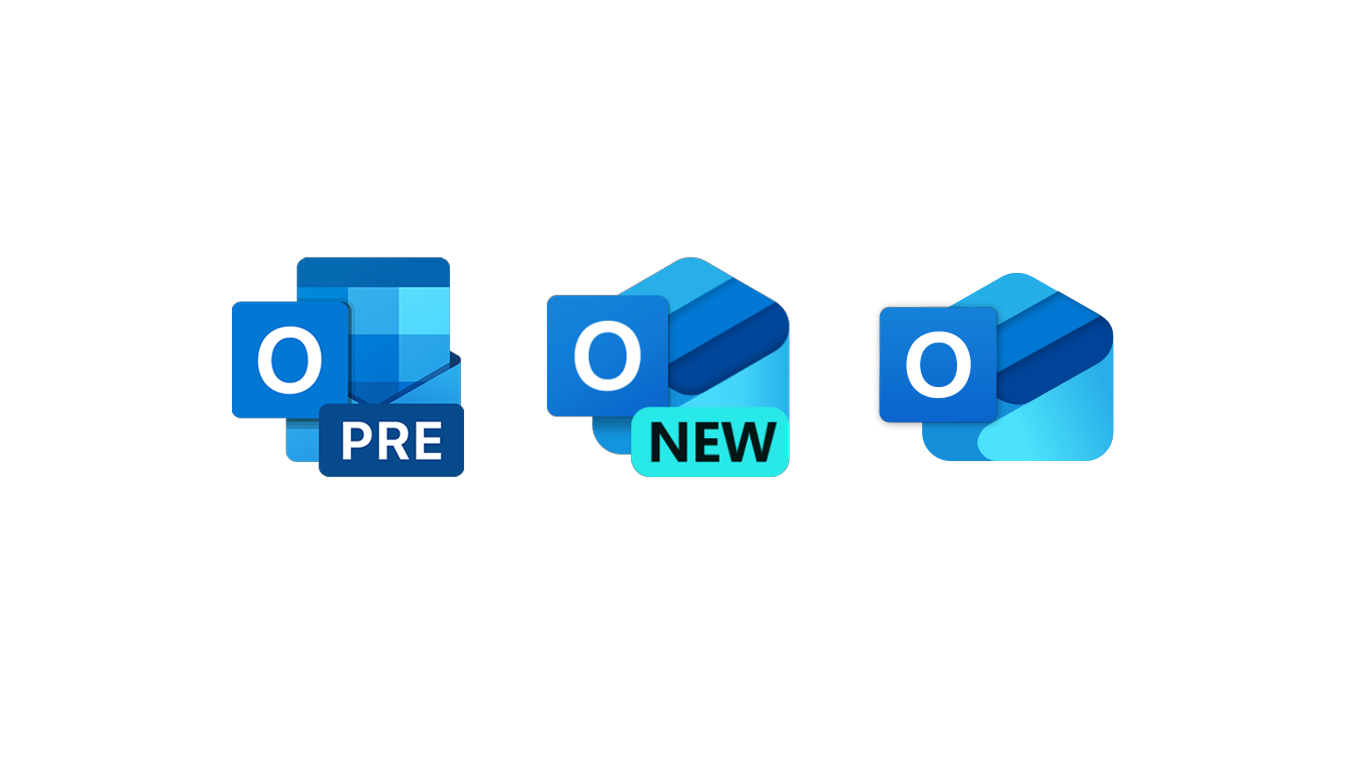
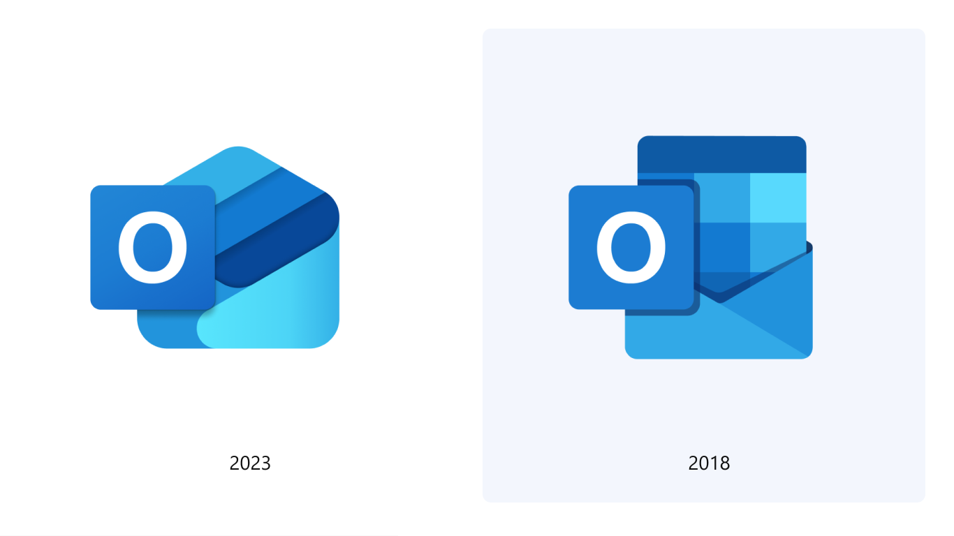
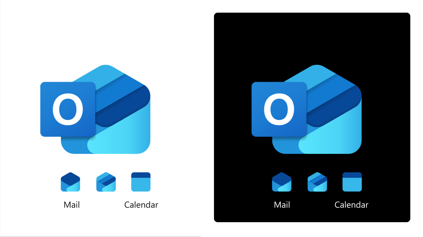
Outlook’s existing Windows app icon needed modernization as part of the One Outlook unification effort serving 400M+ global users. The high-stakes rebrand required evolving Outlook’s visual identity while maintaining brand continuity across consumer and enterprise surfaces—a critical touchpoint impacting user recognition and trust.
Task
As Senior Design Lead and Design Manager, I owned end-to-end creative direction, stakeholder alignment, and team coordination for Outlook’s icon evolution. My responsibility was to deliver a globally resonant icon that honored the brand’s legacy while positioning it for future growth.
Key Objectives: Define design principles, manage cross-functional collaboration, ensure accessibility compliance, and coordinate seamless implementation across multiple teams and timelines.
Action
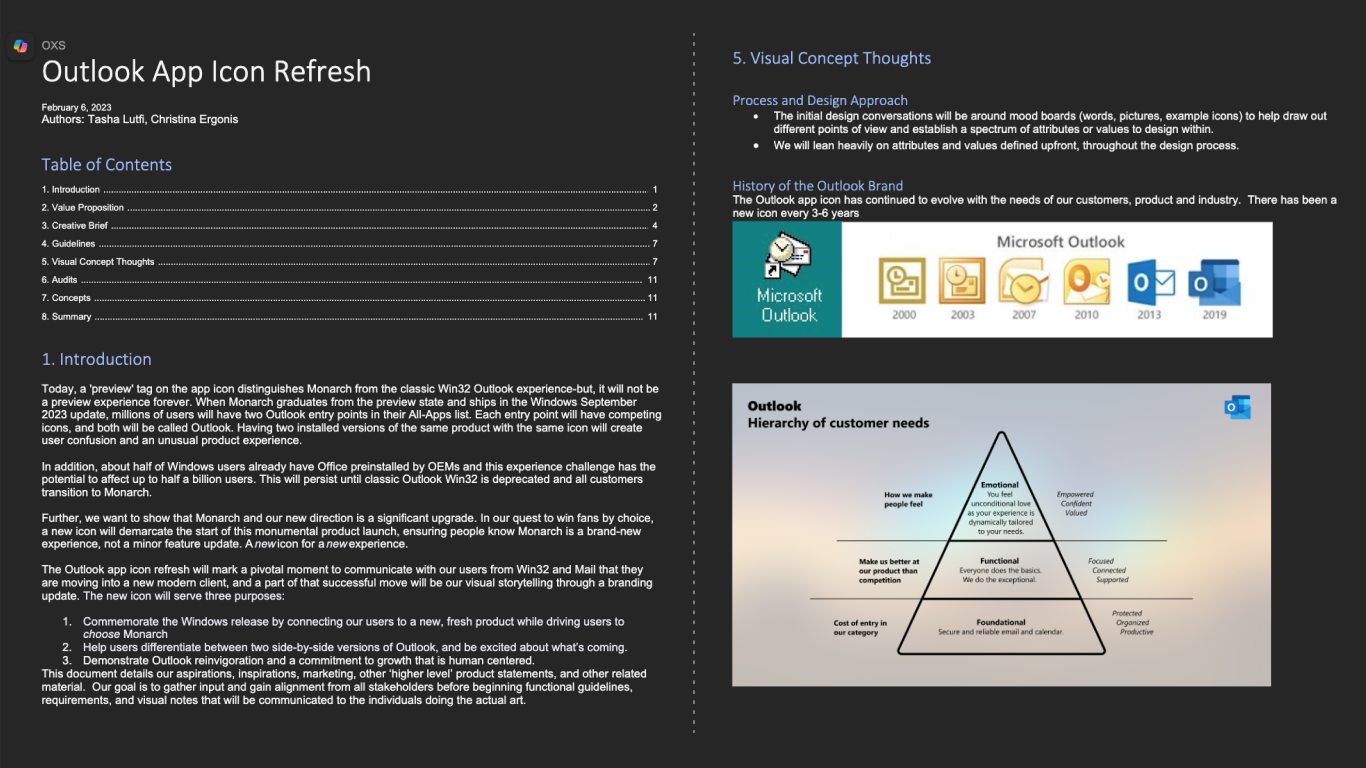
Strategic Foundation: Authored comprehensive creative brief establishing design principles and customer value propositions. Applied customer obsession by conducting research with global audiences to understand cultural and contextual needs. Partnered directly with studio management and Fluent Design teams to ensure operational alignment and resource optimization.
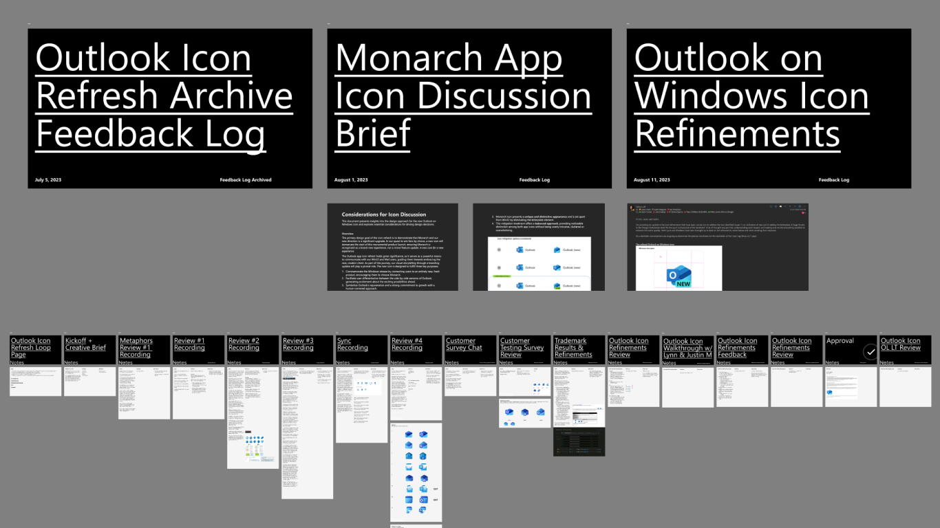
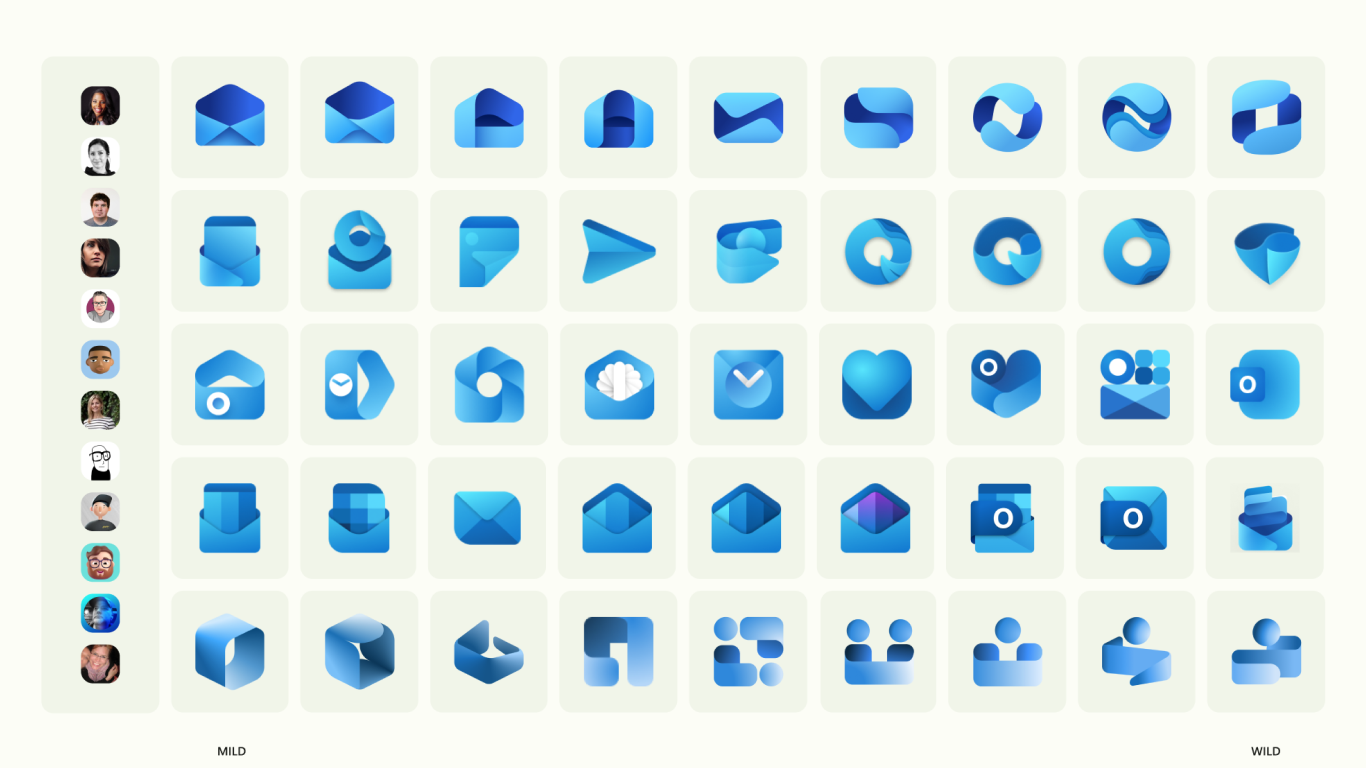
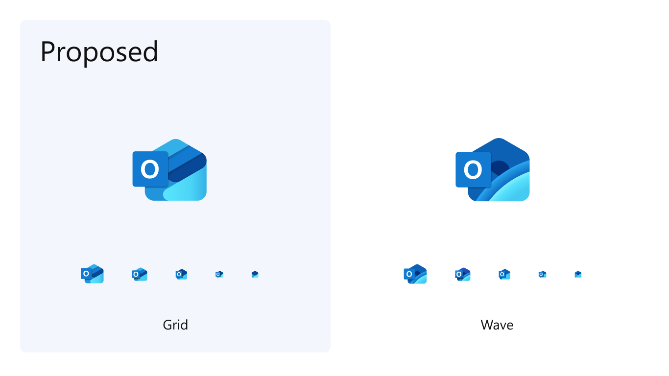
Team Leadership & Collaboration: Managed 2 direct reports while orchestrating collaboration with 4 Fluent designers. Demonstrated ownership by personally facilitating hands-on working sessions for rapid feedback synthesis. Applied think big principles by exploring 100+ icon directions, then used judgment to refine to 2 final options through iterative reviews.
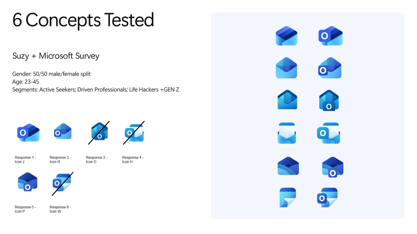
Quality & Delivery: Led comprehensive accessibility reviews ensuring readability at small sizes (16–32px) across light/dark themes. Coordinated closely with engineering teams, applying deliver results mindset to ensure seamless integration. Synthesized complex stakeholder feedback across design, research, PM, engineering, and executive teams while maintaining creative vision and project momentum.
Results
Global Impact: Successfully launched across Windows platforms to 400M+ users globally. Received widespread internal recognition for exceptional clarity, accessibility compliance, and cultural resonance across diverse markets.
Organizational Excellence: Established new standard for icon quality and accessibility at enterprise scale. Created foundation for brand coherence across the M365 ecosystem, influencing subsequent branding decisions.
Leadership Recognition: Demonstrated ability to synthesize complex cross-functional feedback while maintaining creative vision. Proven capability to deliver high-stakes creative work that balances user needs, business objectives, and technical constraints.
Additional platform rollouts and business metrics under embargo pending public announcements.
